


 George, the man behind Scraffer, got in touch and asked me to print this rather nice Luke Insect designed poster for his group show in Notting Hill. There are some good names there, it looks like it will be worth a trip to the wild west. Because the print is bled to the edges it is printed on larger paper and then trimmed down. This not only makes it possible to pick up the prints without covering your hands in ink, and therefore the next sheet of paper, but also means you can keep the registration marks on each sheet. I got them properly trimmed by helpful guys at Reprocity in Hackney Wick and it makes all the difference to the finish.


 A rather fine London map by Joao Fonte printed on recycled paper sourced (as they say) by Joao. He's told me where he got it and I think I may be getting some in for people pretty soon, I am often asked for a paper which is properly off white. I think Joao told me he originally drew this as a freebie for the ad agency where he works, with their office featured in red. Being decent sorts they have let Joao have his design to sell as a print with the advert omitted.
 Two A2 posters printed for Sara Mererid Williams for sale in I think she said Selfridges. Some very small type here, about 10 point, and reversed out of a colour which can create problems with small lines filling in. I was pleased with how crisp I got it all. A fine mesh and a fairly stiff squeegee is the answer. Sara was very pleased too, and has printed stuff herself. Its always very gratifying when someone who knows how tricky screenprinting can be is impressed.
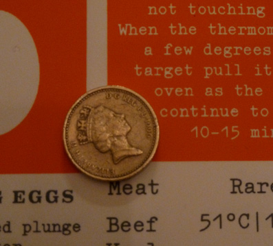


 Print for Cel Out, rather cleverly titled J Pegged, get it? Four colours, well four greys in fact. Sent all the way to Australia where he resides and is selling his stuff quite well.
 Oh why was it only the first two series that made it to a proper channel and left us buying box sets and scratching around the internet for the rest? One day Breaking Bad will be repeated from the beginning on Atlantic or something and I can watch it all again. Little rush job for a guy found me on the web.
 Sometimes the curl on paper from a roll can be quite difficult to deal with. When the roll is nearing the end especially it can be tricky to cut down as it keeps springing up on the cutting mat. I thought there must be a solution and found this device. The D-Roller is a US import, and is very simple and works very well. In fact one has to be careful one doesn't put a curl in the opposite direction it is so efficient! It was plenty pricey of course, but here at Atom no expense..yeah yeah.
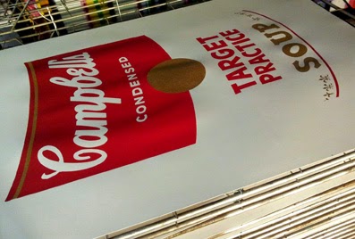
 Seb Chaloner examines his digital and screen hybrid print which is one of a series of four I printed for his show of the above title at 5 Marshall St W1. Opened on the 1st of Feb. I say his show, I think with another guy whose name I dont know under the name Mystery Meat (co.uk) which goes a little way to explain the top image..
 Another order of prints for South London Prints who are valued regular customers. They do very well with small low priced prints at markets in Brixton and Clapham and around. I am trying to persuade Ed to do a screenprint of one of his map images..
 (with a man who looks a little like Duchamp) That's what this screenprint is called! A nice little job for a guy called Ricky Chambers that came out of the blue, I'm just about to trim the paper in this picture.

 Tales from the Two Puddings is a book by Eddie Johnson, full of anecdotes from his time as landlord of the Stratford pub. His tenure lasted nearly 40 years and he gives a fascinating insight into what a side of London was like. The pub was well known in its time for live music, possibly the countries first disco upstairs, and an always lively mix of East End characters, if you know what I mean! Eddie gave a talk with Robert Elms at the Bishopsgate Institute and signed books afterwards. The photographs were all printed by Atom and show some of the, always very smartly turned out, regulars and staff of the Puddings. The book is a great read often very funny and always interesting, and the photographs are a wonderful glimpse of a different age and a very different East End.
  A screenprint in two colourways for Mr Cee for the group show of the above name. Close up trying to show the nice thick ink achieved with a coarse mesh. Also in the show is Batlow and I did some very nice digital prints for him but forgot to photograph them, sorry B!

 A spoof Ouija board printed on wood for Darren Cullen who goes by the name above, have a look at his web site of the same name for lots of very funny stuff. He told me the board was a prize for Mystic Mark's astrology column in Scottish listing magazine 'The Skinny'


